The Redesign
What is Lose It App
Lose It is a mobile application that empowers users to achieve their weight loss goals through a user-friendly calorie counting and food diary experience.
The app simplifies the weight loss journey by guiding users through a goal-setting process. Users specify their desired weight loss amount and timeframe, and app generates a personalized daily calorie target. By adhering to this target for the chosen duration, users are equipped to reach their weight loss aspirations.
The app also offers a comprehensive resources to support users's weight loss/management. This includes access to home workout routines, healthy recipe options, and engaging challenges to keep users motivated throughout their wellness journey.
Why Redesign?
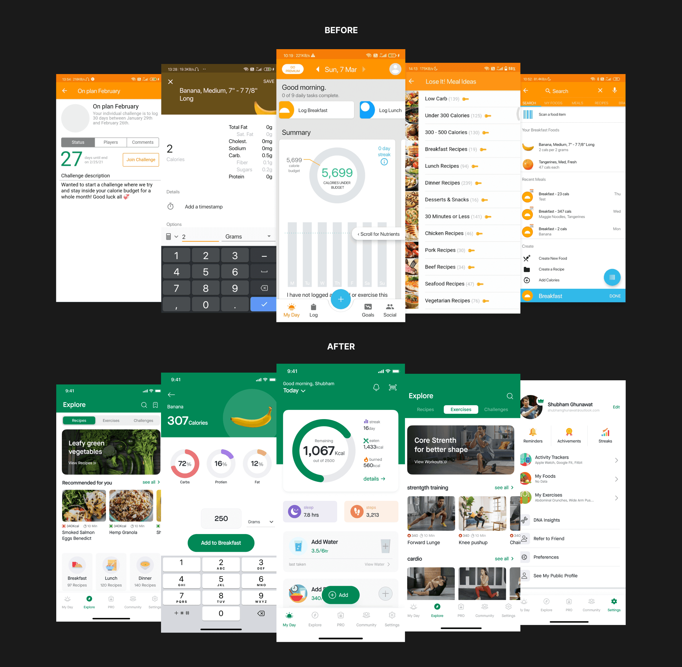
While the app boasts a successful track record with over 10 million downloads on the play store, the disappointment I felt as a user with the primary goal of weight loss in terms of UI/UX was excessive.
There was an huge opportunity to improve the user experience (UX) in certain areas and I took this as an opportunity to redesign this app and to enhance my learning experience.
Setting up "Goals"
Apart from Enhancing The User Experience by fixing usability and functionality Issues, I had these Two reasons I redesigned this app.
Ability to Easily navigate through the app: Rethinking the Information Architecture — The information needs to have in an organized, structured, and effective manner; since most of the play store’s critical reviews that I have gone through having this in common.
Make it super accessible: I noticed how distinct elements of the process and the interrelationships among the various steps function in a way that certainly doesn’t help the user.
The navigation flows are not user-centered, the WCAG Contrast is failing on CTAs, and so on, which I will talk about in a while.
The users use this app worldwide in various demographics by various ages of users with different levels of tech-literacy, hence the information must be accessible to everyone in a simple and clear way.
Let’s take deeper dive into the process
I began with a thorough analysis of the app and explored what existed and where was room for further exploration.
When I got familiar with the app by using the app for a couple of days, I had some rough ideas of what I wanted to change in this app.
I went through other similar apps that are in the same domain to see how they are accomplishing in terms of UI/UX. I also visited the app’s play store reviews, tried to find user’s frustrations, & noted the very common critical reviews.
then I took screenshots of the current app and put them into Figma file flow-wise which helped me to understand the app and shape my ideas better.
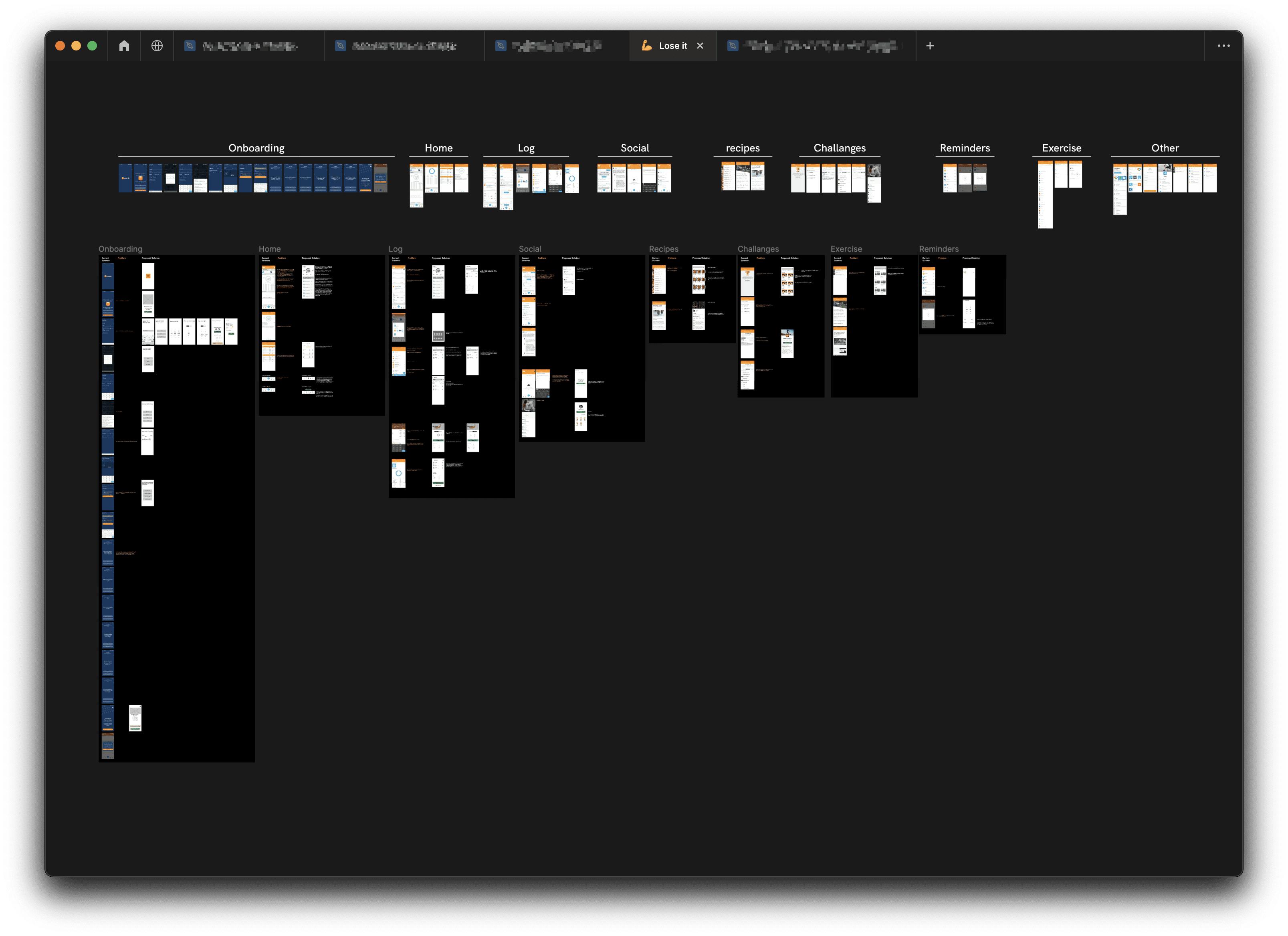
Then I visited each screen in my Figma file one by one, flow by flow and noted down every point where I had thoughts about the improvements. I prioritized my findings according to their importance & defined the main issues that I had to solve.
I also put its solution’s wireframe beside each screen that helped to bring priority and clarity to my thoughts about feature placements & I could come up with better ideations.
Alright now, let’s break it down one by one!
Onboarding
Current Onboarding
The current onboarding flow looks something like shown in the below image

Two points to make here:
App asks the user their basic details; and desired weight and time (Screen 01–08 in the below image)
App asks users some questions to give the user a personalized feed for recipes and workouts.
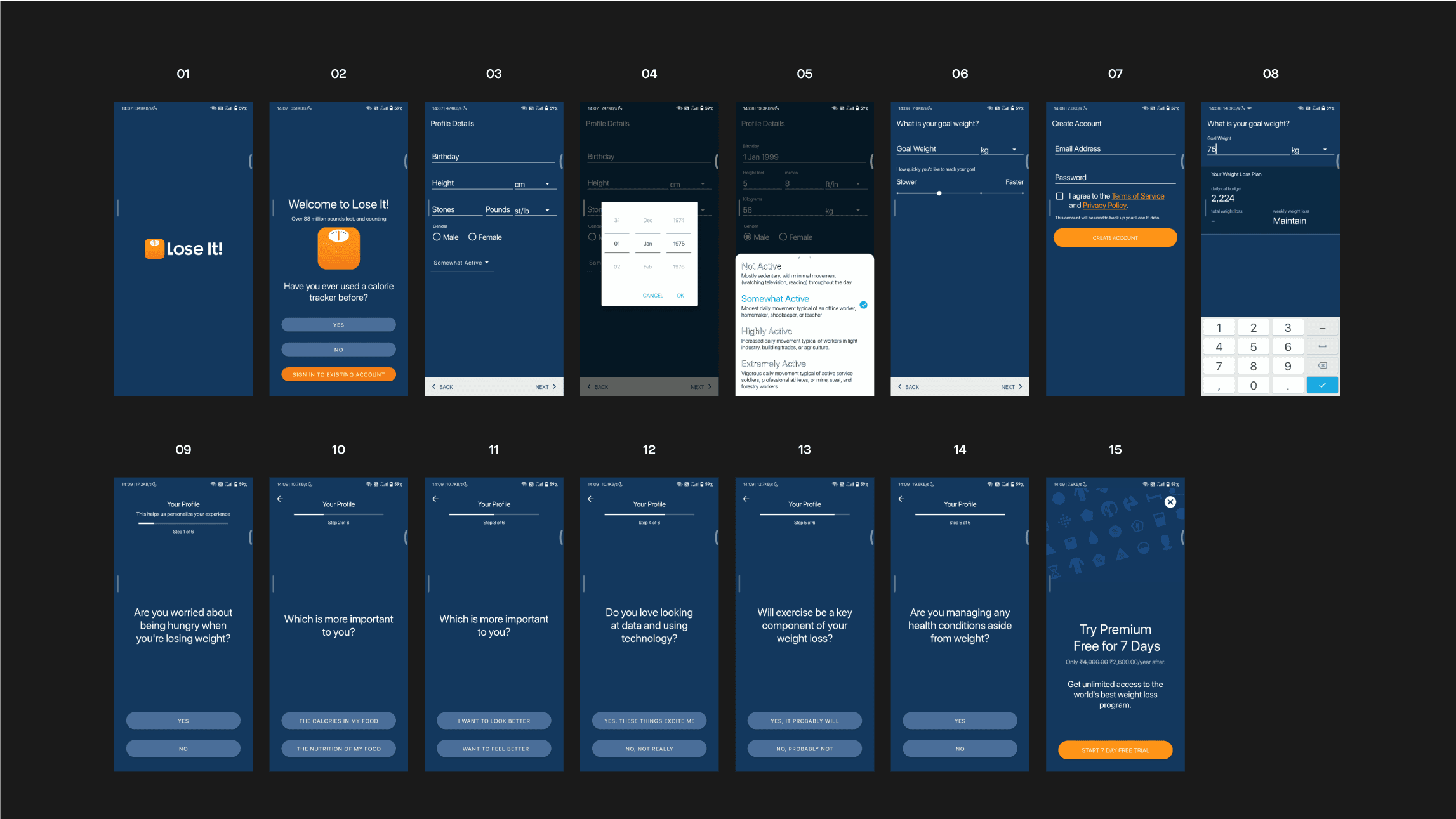
The number of screens here can be reduced to give a faster and less time-consuming onboarding, the survey can be taken inside the app.
Redesigned Onboarding
Now the onboarding flow looks something like this

I made 3 big changes here
I added a BMI Calculator in the app!
Let’s just say if a user wants to lose weight, and he/she has a clear number in his mind of how much he/she wants to lose.
but what if the user doesn’t know how much he/she should lose 🤔🤔
BMI calculator will help those users by considering their basic details that the app asks users in the beginning and based on it app will suggest a healthy number to users.
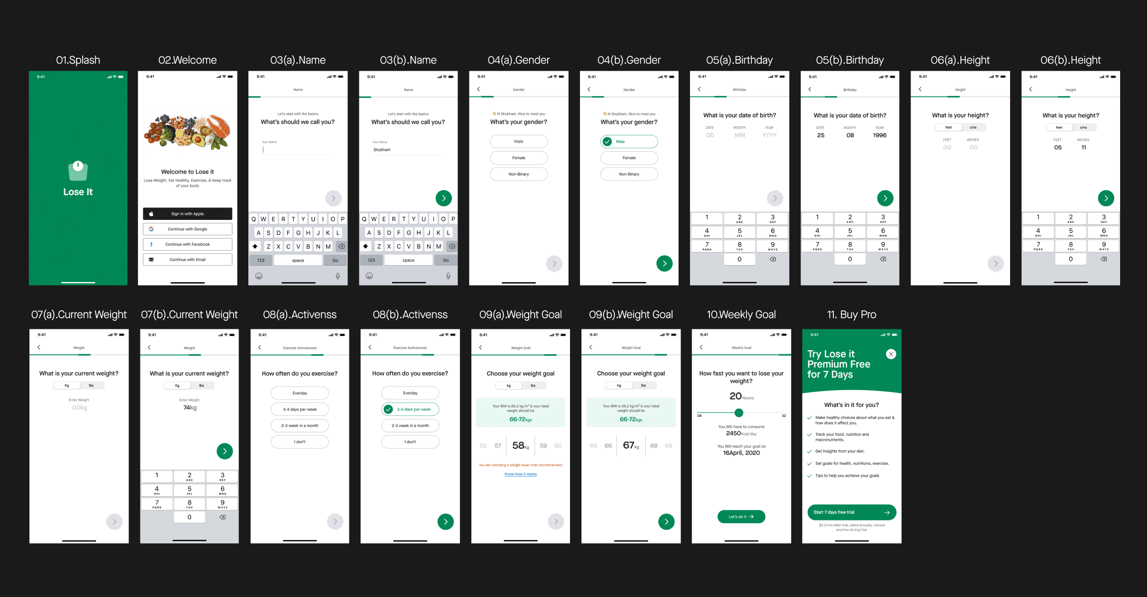
I asked one question at a time, “To Minimize Task Perception”
Separating fields in distinct steps eases the user’s perception of how hard it is to complete a task and makes the entire process look easy.
Moved the survey inside the app & added a sign-up and sign-in option with their Apple ID, Google, or Facebook account to give users a faster and less time-consuming onboarding.
apart from these,
I divided the onboarding process into conversational steps so that it does not overload the user.
Added a progress bar that guides & corresponds with the user through several steps
Screen #10. Weekly Goal shows the expected date of user's weight loss/management journey.
I also made sure onboarding screens look good even on smaller screen devices, so I designed onboarding screens for iPhone 8 too.
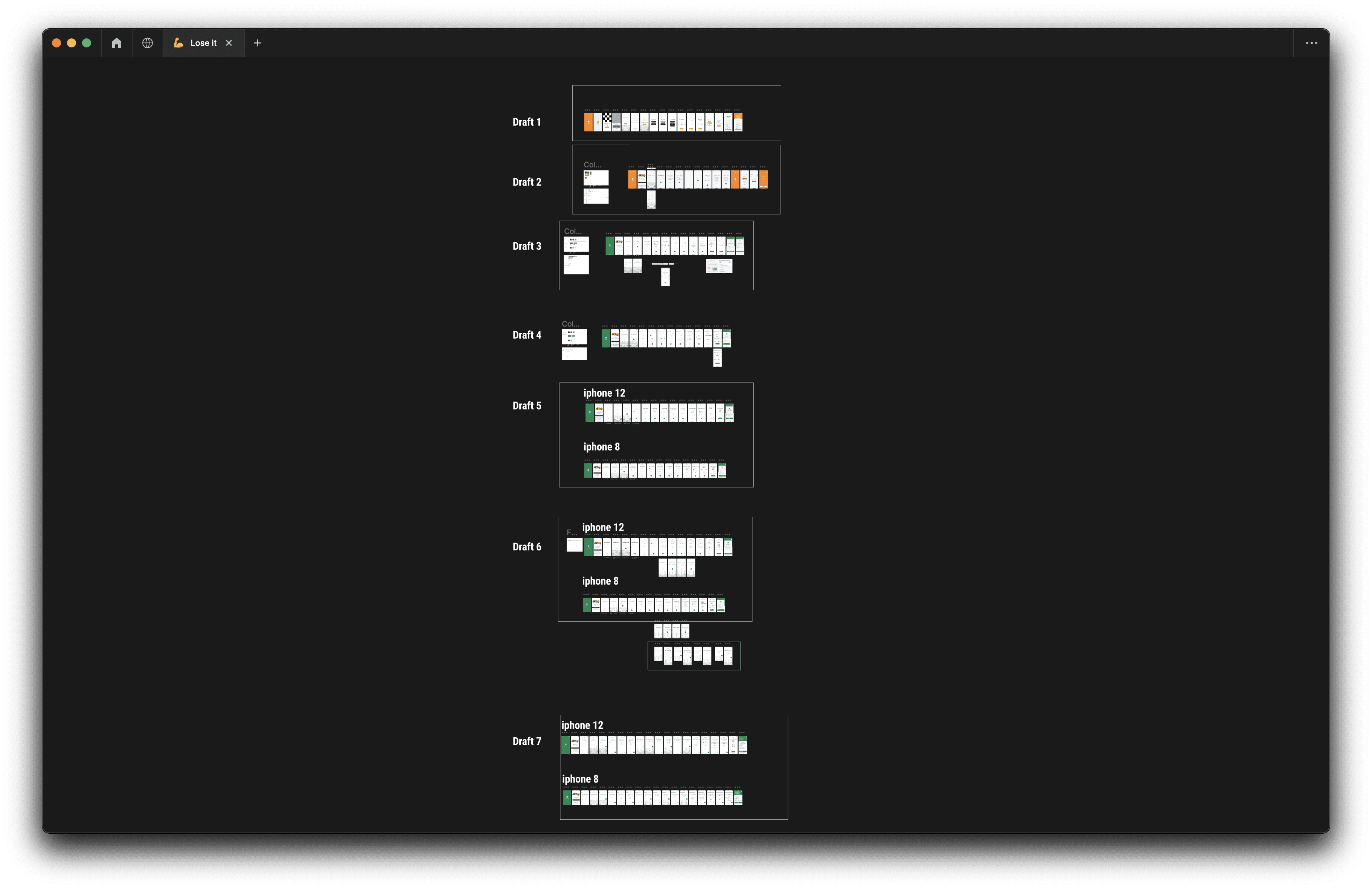
I made multiple iterations to make the best out of onboarding UI and definded guidelines such as he distance of the “NEXT” toggle button from the bottom that would remain the same across devices or the distance for questions from the top nav bar, and so on.
Navigation
okay so now when a user has completed the sign-up or sign-in process, he/she can browse the app
Where the app’s navigation can be divided into 6 steps
The bottom navigation has 5 entities and Profile is on the top Navigation along with “Go Premium” as shown in the below image;
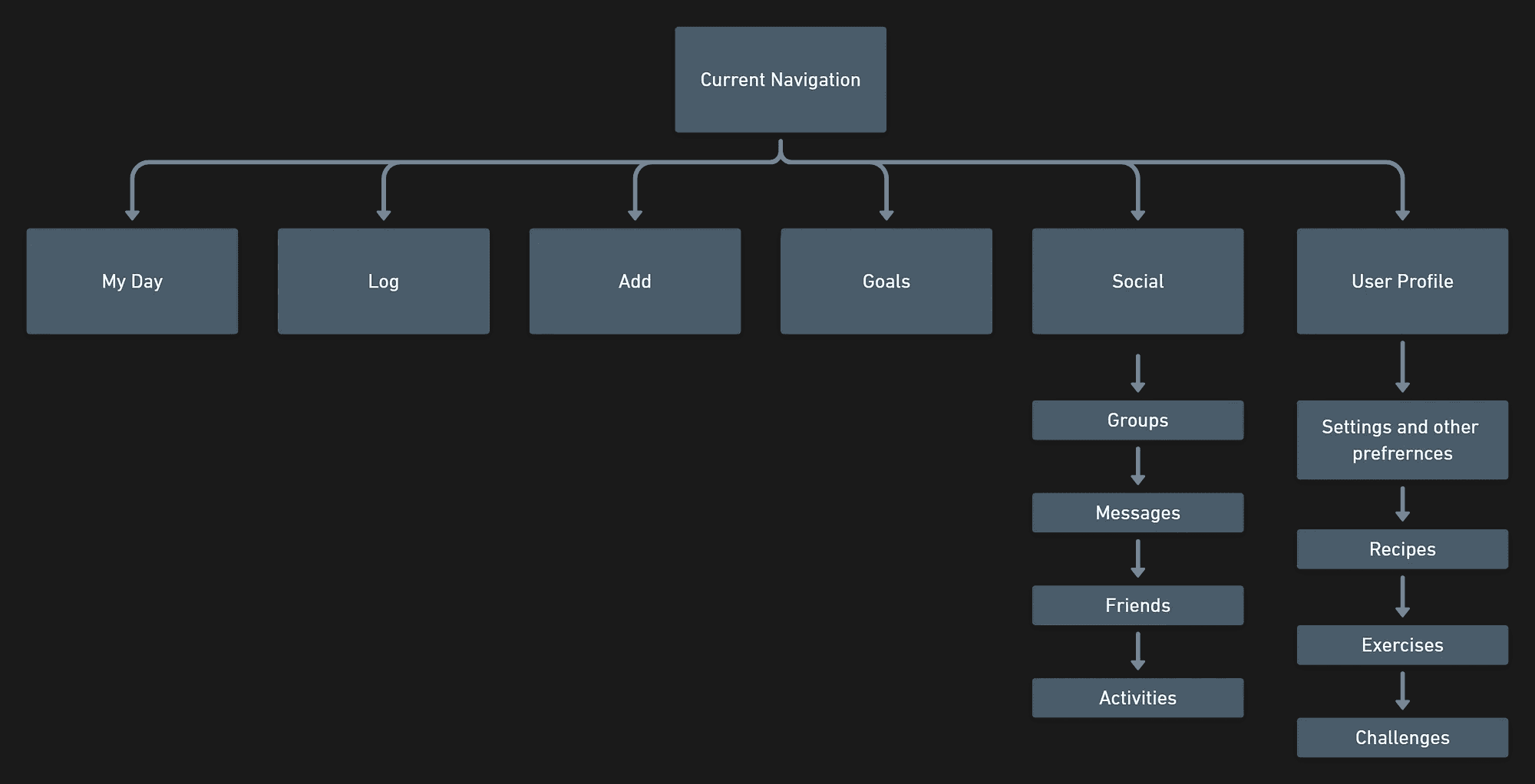
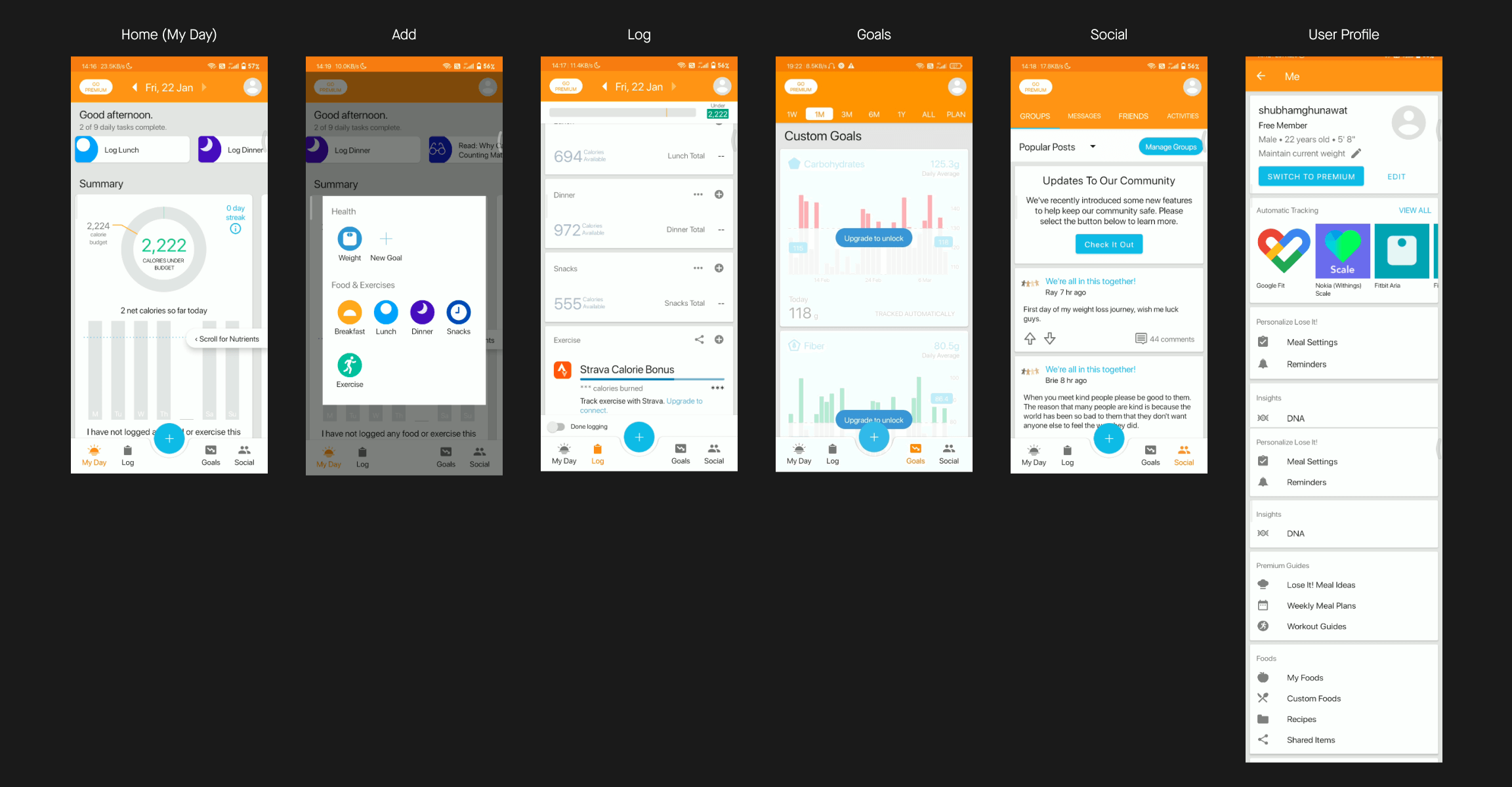
Just to give you a brief context;
My Day- User can see his/her daily and weekly calorie consumption data.
Log- User can add food from here.
Add- Allows users to select food, activity, weight, quickly and add them.
Goals- Users who want to track their nutrition(Carbs, Protein, Fat), can set goals from here.
Social- Users can socialize with each other, can be a part of groups and communities, can make friends, chat with them, etc.
Profile- This is a part of the top navigation, in which users can find recipes, exercise, challenges, can edit his/her profile, set app preferences, and other stuff.
I revamped the current Navigation flow to something like this
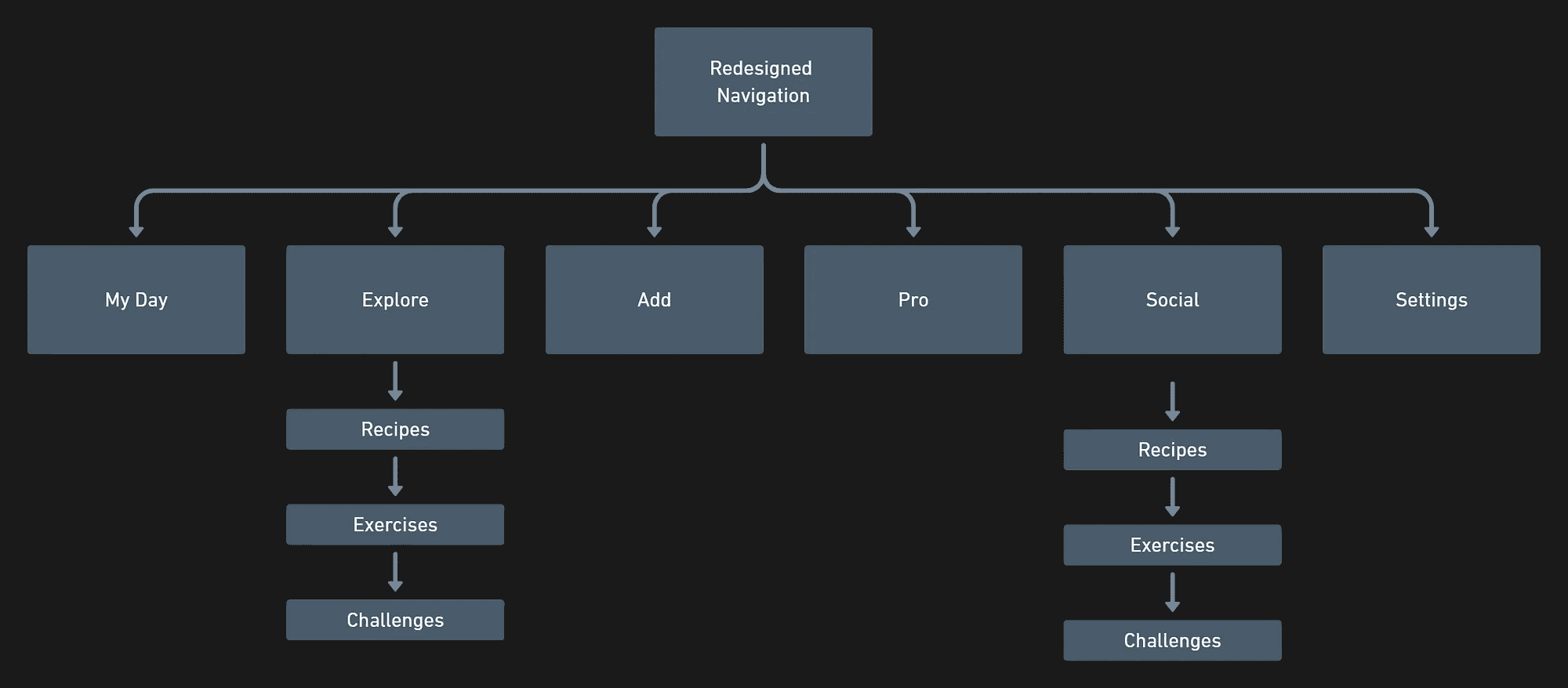
Alright now let’s break it down one by
Home (My Day)
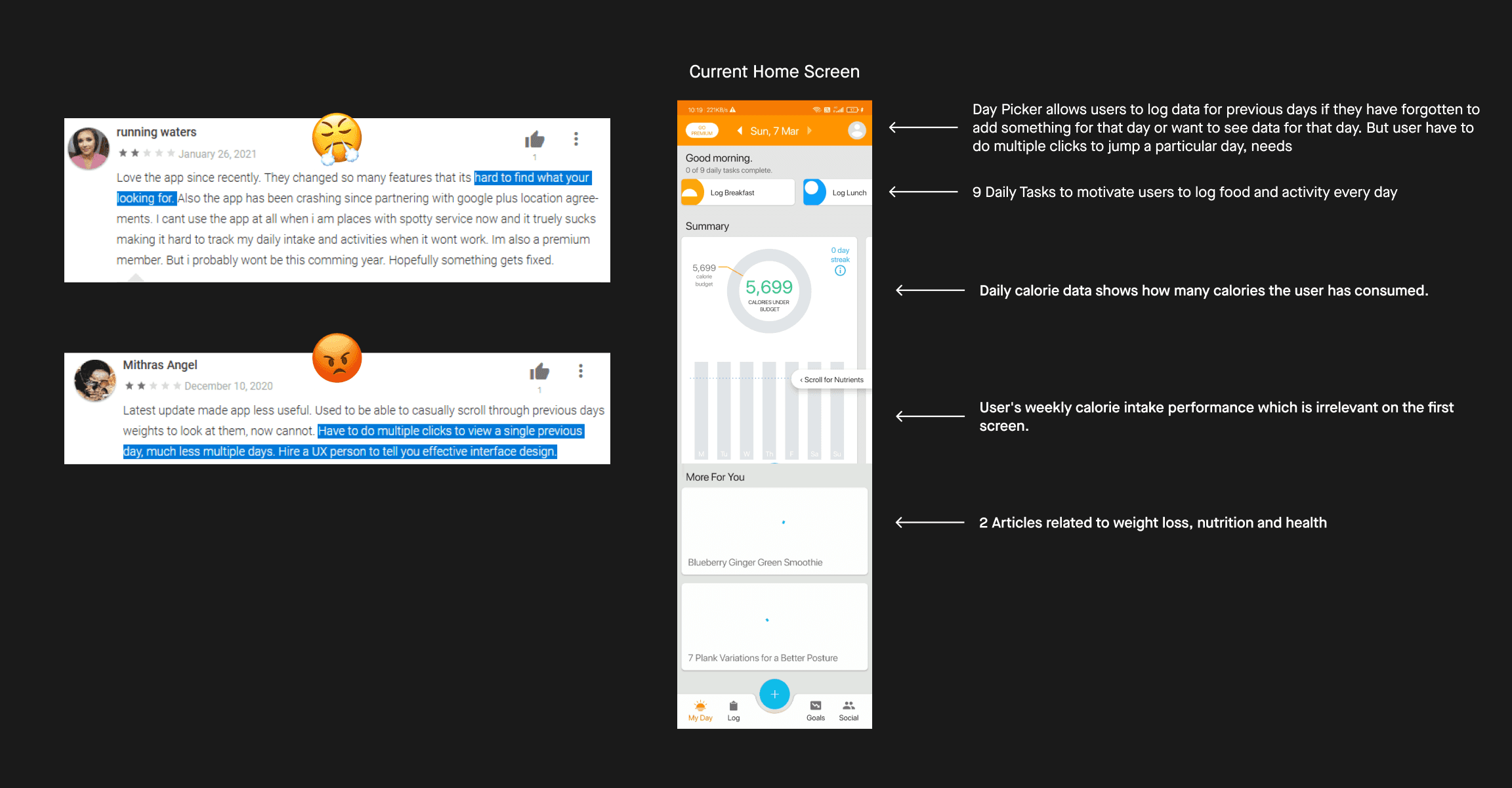
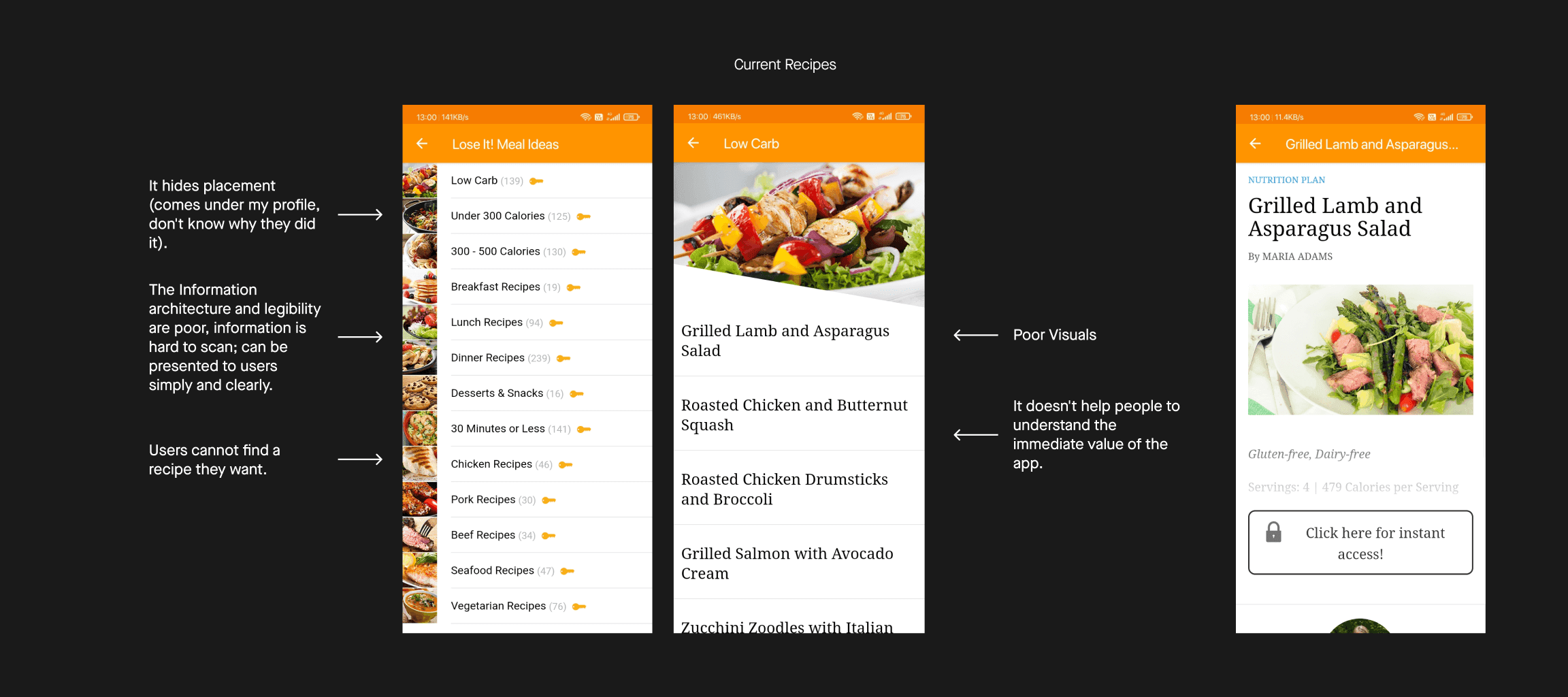
This is what the current Home Screen looks like;
Redesigned Home Screen
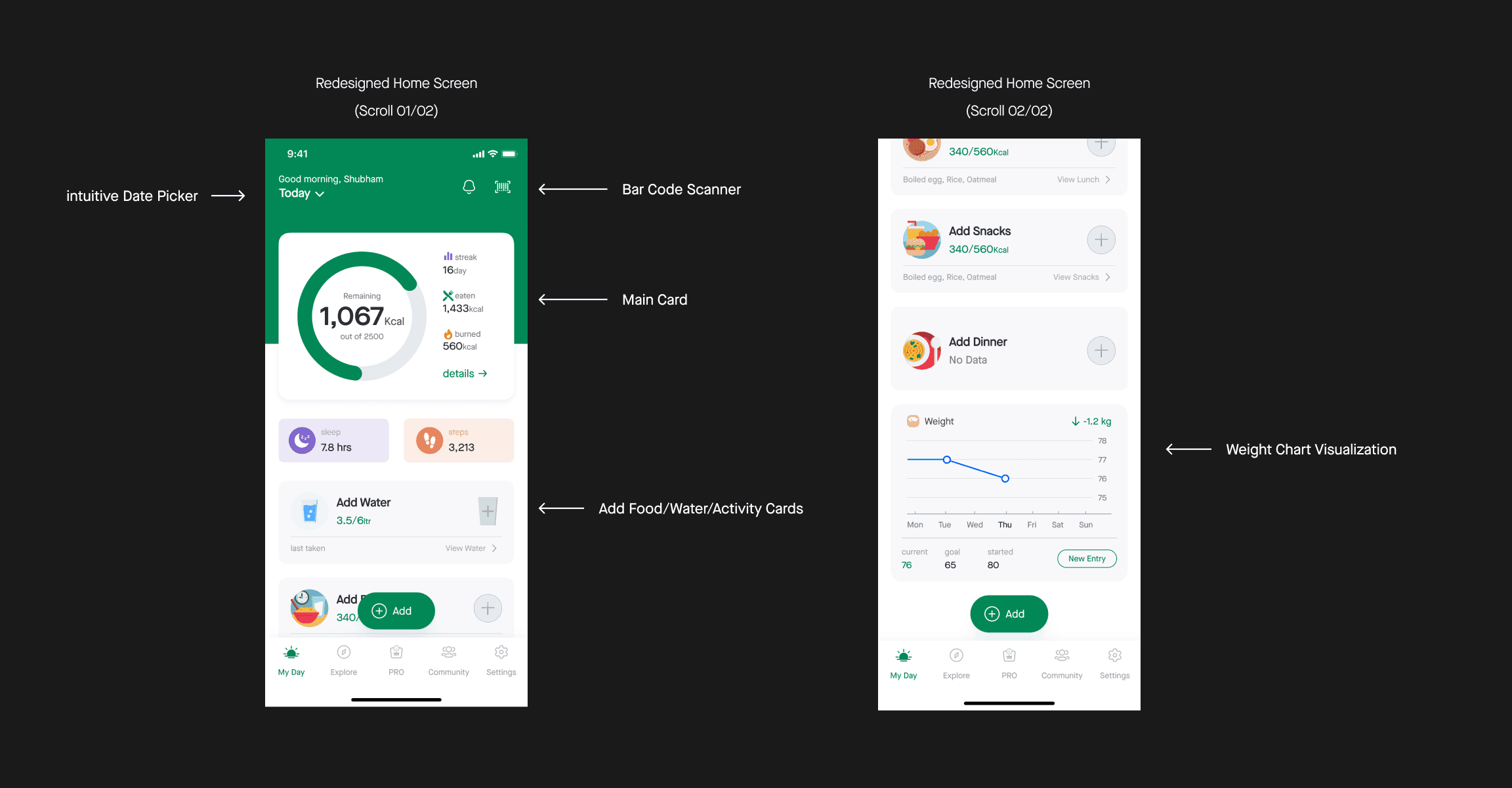
okay now let me explain what did I changed here and why;
First, I changed the date picker; it will allow users to jump to a particular day, without doing multiple clicks
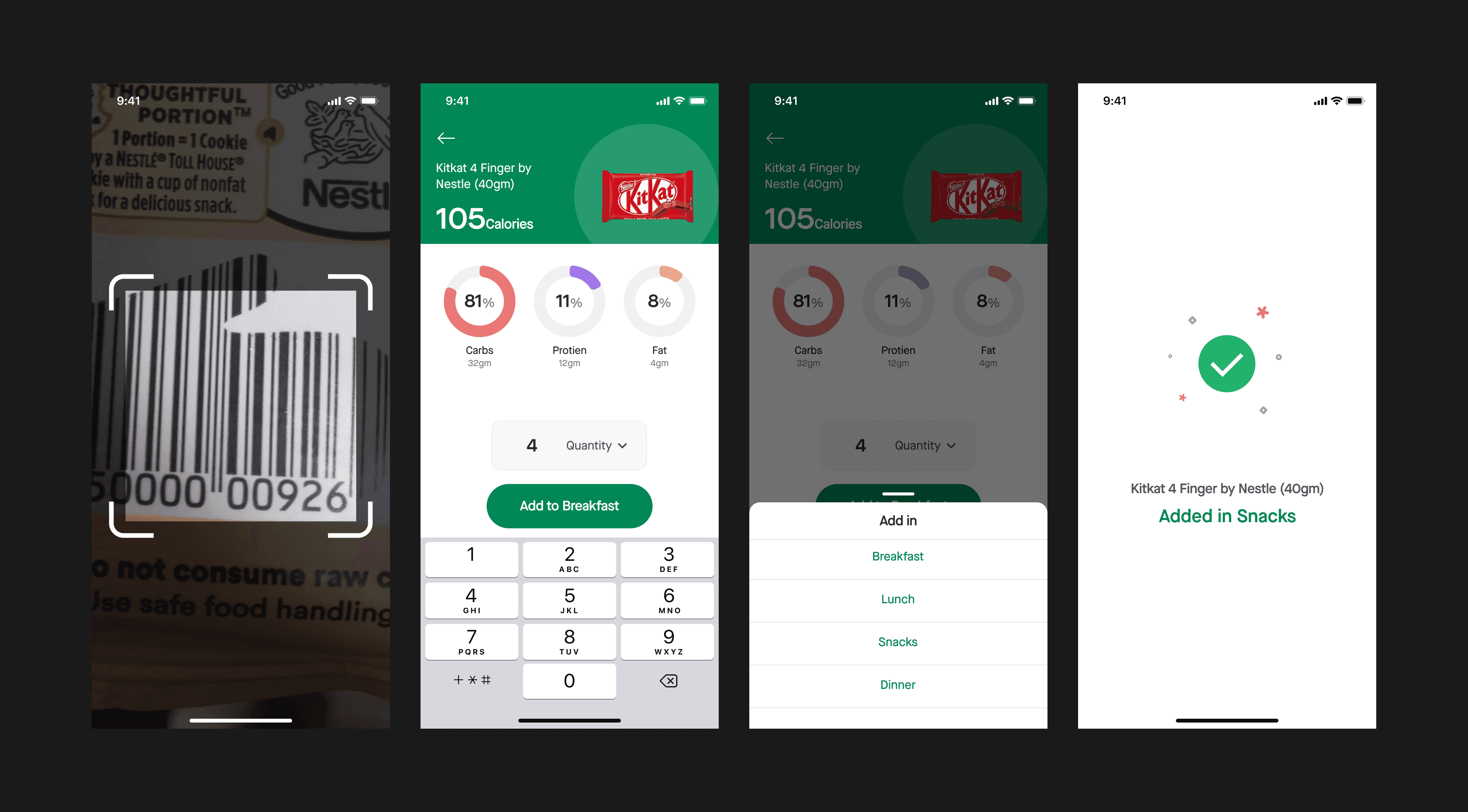
Then on the top right, I added Bar Code Scanner along with Notifications;
Lots of time people eat packaged food in their day such as chocolate, drinks, chips. right?
Every packaged food comes with a Bar code, Now users can scan bar-code and can quickly log into the app.
Then we have the Main Card which shows the same information in a simple, intuitive, and easy-to-digestible way.

User can see nutrition information by tapping on “details →” on the main card
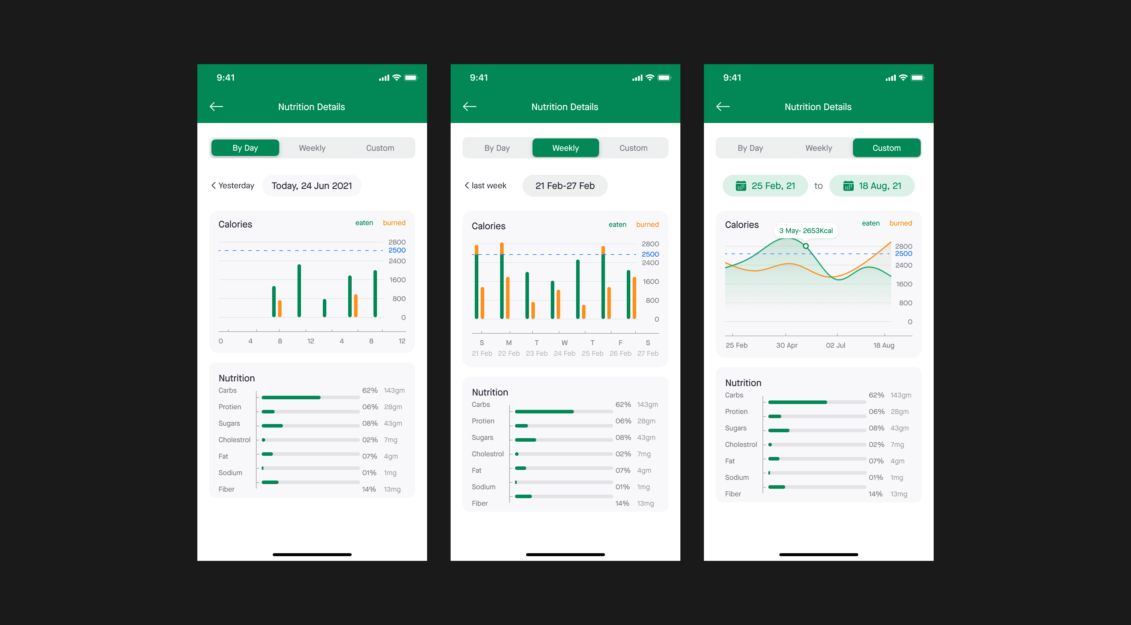
Now the user can see calories and nutrition into intake by day, by week, and also with custom duration
Furthermore, we have these cards; I moved these cards from the “LOG” Tab to the Home (My Day) screen.

I added one more card on the home screen “Weight” which shows the User’s weight journey

Explore
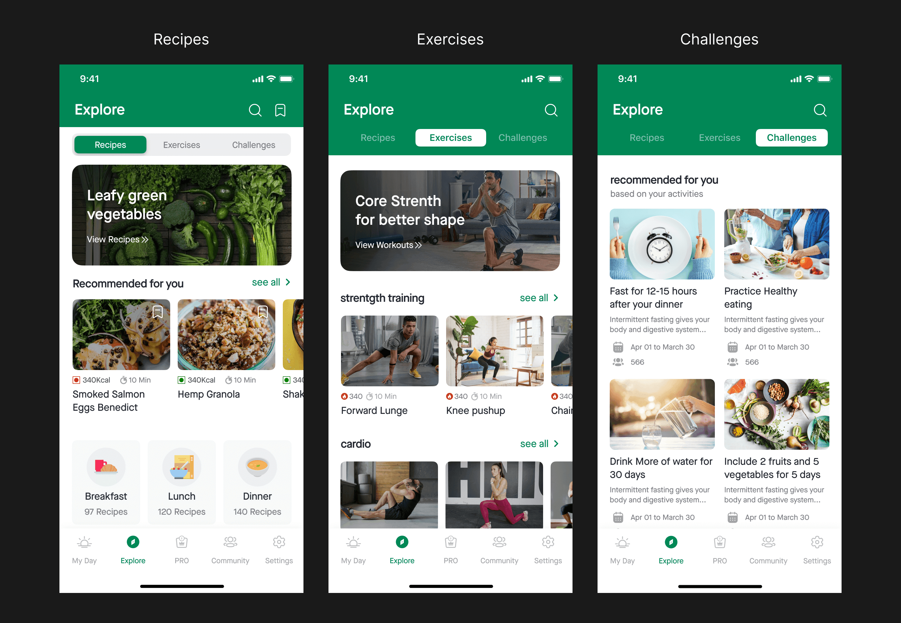
I introduced this new Tab in the App where users can find recipes, exercises, and challenges.
Currently, the app shows the same under the user profile, something as shown in the below image
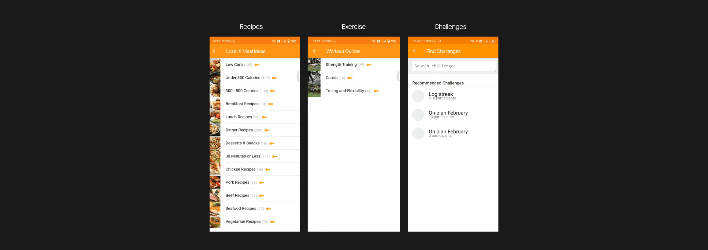
Recipes, Exercise, and Goals are premium features in the app, to which I didn’t have full access.
let’s talk about one by one;
Recipes
App offers a wide range of recipes that are specifically designed for people who want to lose weight & who deeply care about what they eat.
Redesigned Recipes Tab
I arranged the layout in such a way that a user can easily scan the screen, see what is important, and decide.

I revamped the whole flow while doing so I didn’t want to overwhelm the users with too many options as; It may lead to a bad user experience.
I revamped the whole flow while doing so I didn’t want to overwhelm the users with too many options as; It may lead to a bad user experience.
Now each recipe card has the information that will help the user to take action
Veg/Non-Veg Glyph
Amount of calories
Cooking Time
Bookmark button
I added the “Search” and “Bookmark” features; Search will allow the user to quickly find what they are looking for, and they can save recipes for later using the bookmark.
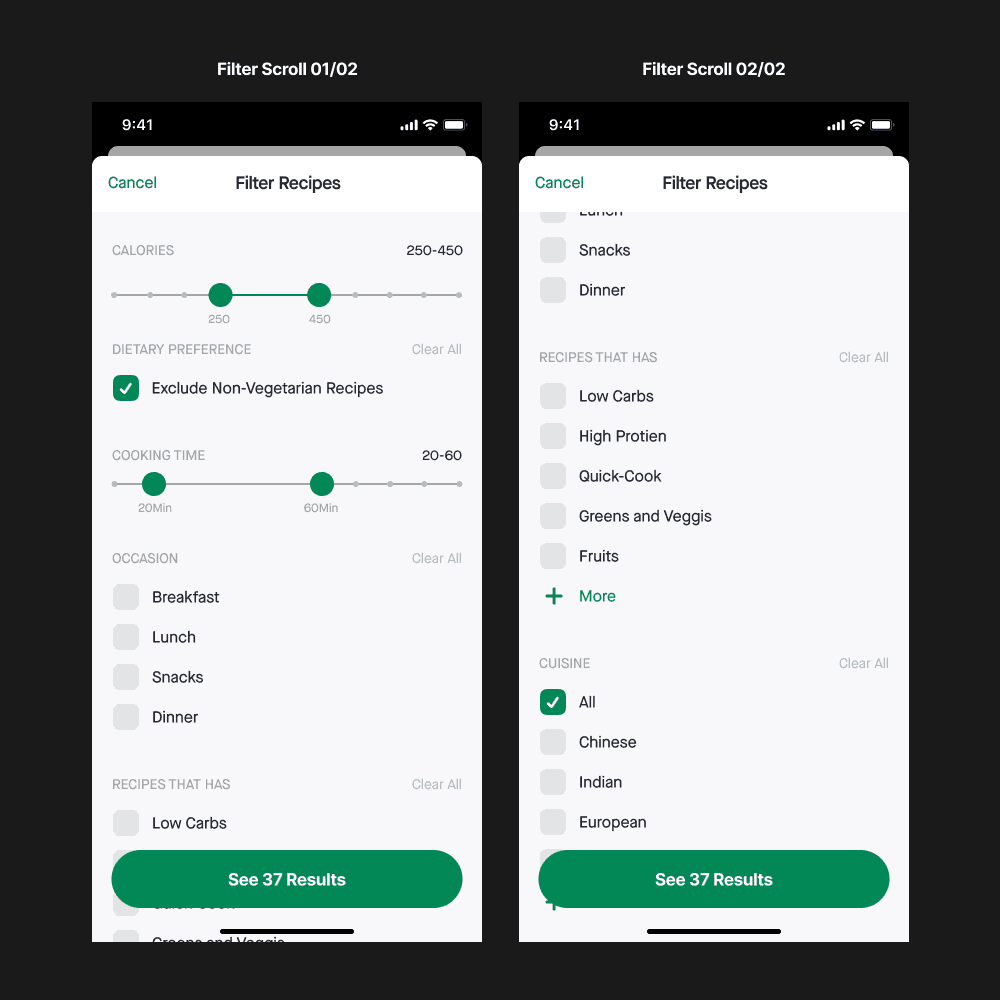
I Included a filter option in Search it will correspond to their specific needs & Users can apply filters based on the following.
Calorific value
Type of cuisine
Cooking time
Type of meal
Recipe Type
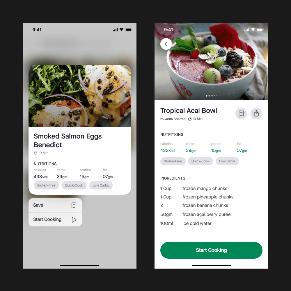
I also added a Context menu model to the recipe card, if you don’t know what context menu is? well ever heard of 3d touch? they are kind of similar!
it will allow the users to take a quick peek at the recipe details without doing back and forth again and again.
Now users can also see the nutritional value of the recipes and additional information, can share recipes with friends, which would make the whole flow more usable and pleasurable

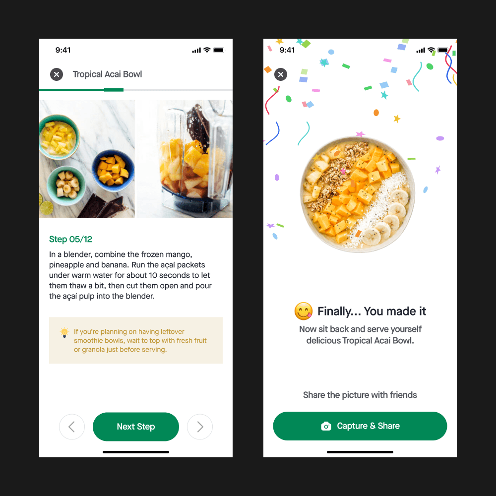
Now when the user finishes the cooking app asks the user to share the picture with their Lose It friends
It will increase user engagement on the platform and Users will socialize more often than before with each other
The heading here “Finally” you made it”, I thought of it as a dynamic means, every time users cook a recipe it won’t be the same.
okay so you cooked something, let’s do some workouts
Exercises
The app offers a set of exercises that are designed for people who either don’t want to go GYM and prefer Home-Workouts.
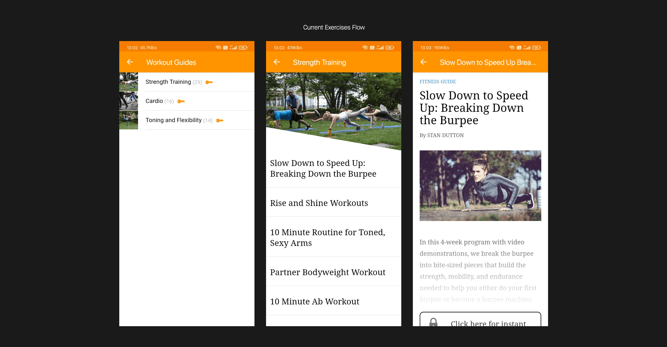
Visual aesthetics & ergonomics needs improvements, and the layout can be more interesting.
Redesigned exercise flow
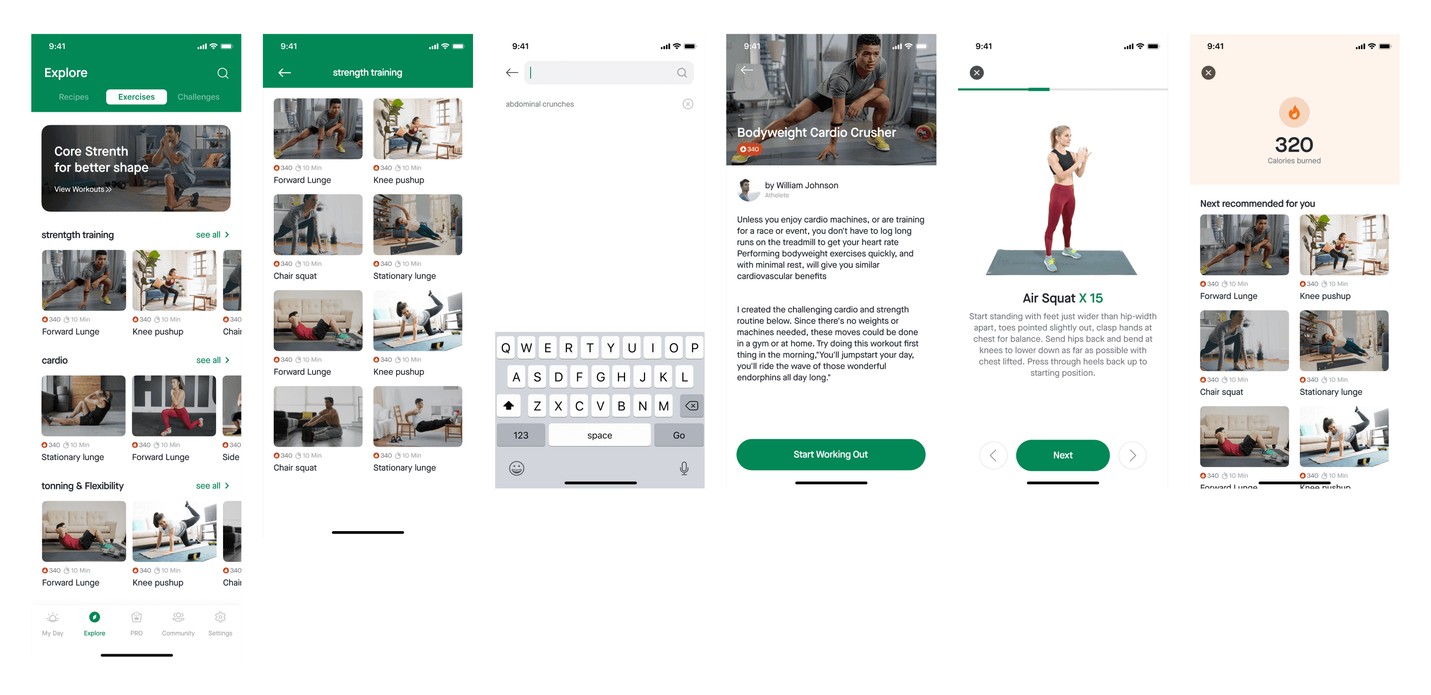
We can show the same exercise page in a much better way, as shown in the image
Now the exercise card has a big thumbnail image of it along with the name of the exercise also the number of calories the user will burn from it and the time it will take to finish.
also, I added a “Search” so that people can search for what they are looking for
Challenges
We intend food to be eaten to provide nourishment to our body, but some foods are good for us and are bad for us (in terms of Nutrition), foods that are over-processed foods that aren’t really food.
The app tries to let the users recognize bad food, or bad eating habits by showing challenges to the users that might help them in their journey also can have other benefits such as;
Reduced BMI
Improved emotional regulation with eating
Decrease snacking and craving
Improved digestion, improved metabolism
Reduced overeating or Improved food choices
and this is what the challenges in the app look like;
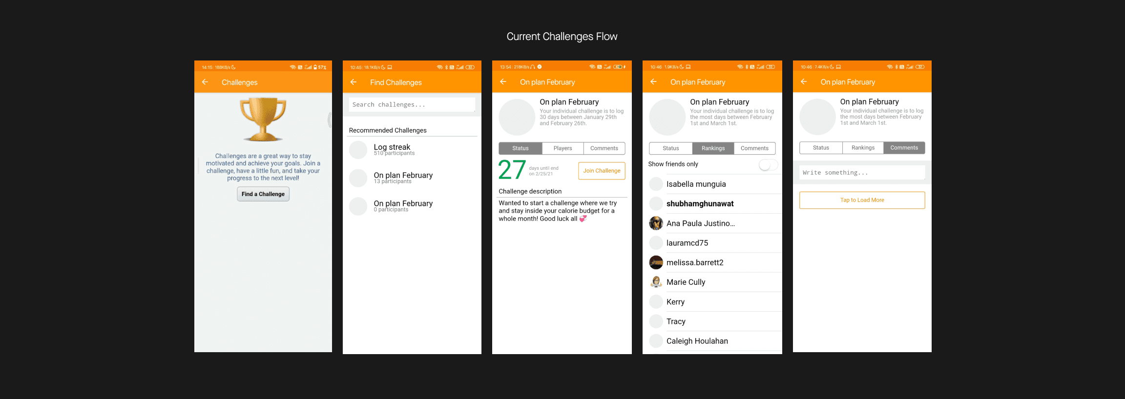
The way they have put challenges in terms of UI/UX doesn’t help the users to see the actual value of the app
It’s important to recognize user’s needs, preferences, expecting them in the interface that understands and fulfills them. In a single word, “User-Centered Design”
Redesigned Challenge flow
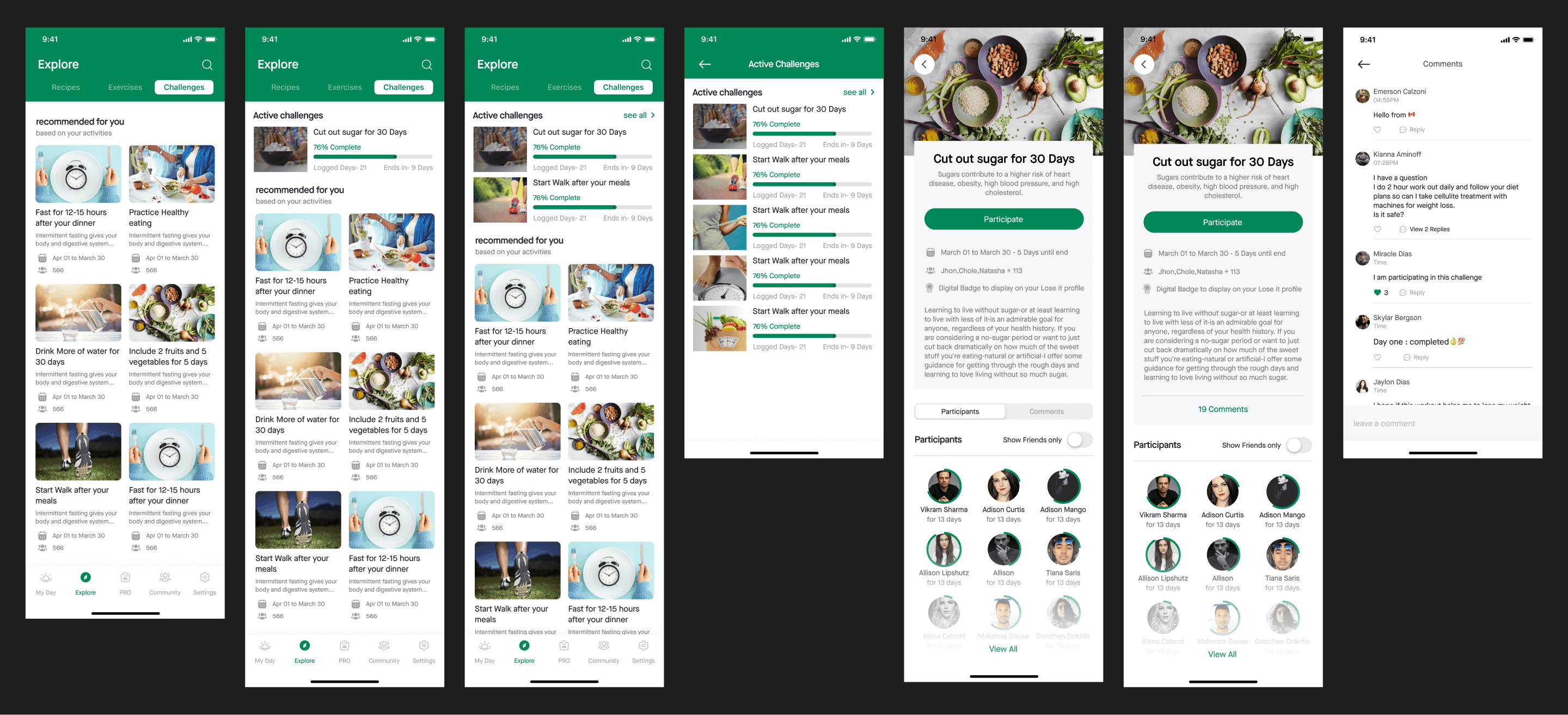
okay so on the first screen in the image above the user can browse and see challenges, can search a particular challenge using the search icon on the top right
if the user has taken part in a challenge, then it would look like the second screen in the image above
if he/she has taken part in over 2, then a “See All” button would be there like screen 3 so that the user can see all his/her challenges on a dedicated screen
the fifth screen is the Challenge Detail screen, where the user can see all the information related to that challenge
the seventh screen is of comment that users have made or on the challenge detail page so any user sees what other people are saying about it, the user can also post comments in it.

You can clearly see the current one doesn’t help the user to take action and in the redesigned one I have summarised the information related to a challenge that the user might be interested in;
moving forward…
Add
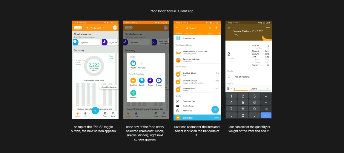
A user can add/log food in two ways first: by tapping on the “PLUS” icon from the bottom navigation and second: by going to the “LOG” Tab
Which I have changed and put in the Home (My Day) screen which I have shown you already, right?
So here I will talk about the first way.
the flow of adding/logging a food flow looks something like shown in the below image;
Redesigned
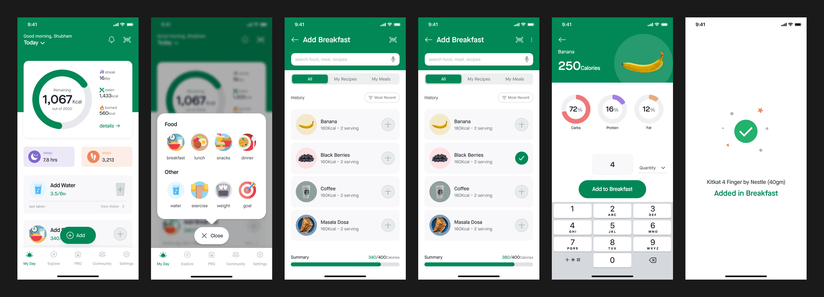
I simplified the number of options to choose in All, My Recipes, My Meals.
Screen 03 and 04- I decluttered the interface and made it easy to grasp the information at a single glance
the next steps also put filter options there, the user can apply filter here and see the data based on;
Most Recent
Most Frequents
A-Z or Z-A
also now a user can add the item quickly by tapping on the “PLUS” Icon right to the item or can search and add.

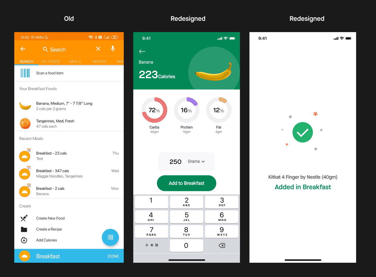
I added one more screen when a user adds food, it gives the user a sign of completion of the task.
The placement of controllers, CTA’s are being done to a certain extent that allows users to do operations with a single hand for ease of access & reachability
moving forward
The next tab is “Goals”, as I mentioned earlier, it’s a premium feature and I’m not a premium user of this app I don’t have access to the data on how does it works, will have to skip this one.
but you might wonder why I didn’t include this tab in the bottom navigation that I have redesigned, well the answer is;

okay? but what about the “PRO” tab, what it is for it?
well, the current app shows ads everywhere when I say everywhere Yes, I literally mean “EVERYWHERE”,
Ads related to the offers and discounts, premium features, etc.
so I created a new tab “PRO”, where the app can promote all the offers, discounts, and premium features.
Nope, users don’t have to download two different apps, it can be done in a single app
Community
The app offers public groups and communities where users can be a part of them and socialize with other users,
which helps people to learn from each other and give support and encouragement to each other to reach their goals,
also people can make friends here, can chat with other users.
below is the image of the current “Social” Tab.

Redesigned Community Tab

I removed the “Activities” tab from the community and divided the flow in 3
My Feed: The user can see a post from his friends and groups he is in.
Groups: The User can see and manage groups he/she is in.
Friends: here a user can see all his chat with his friends.
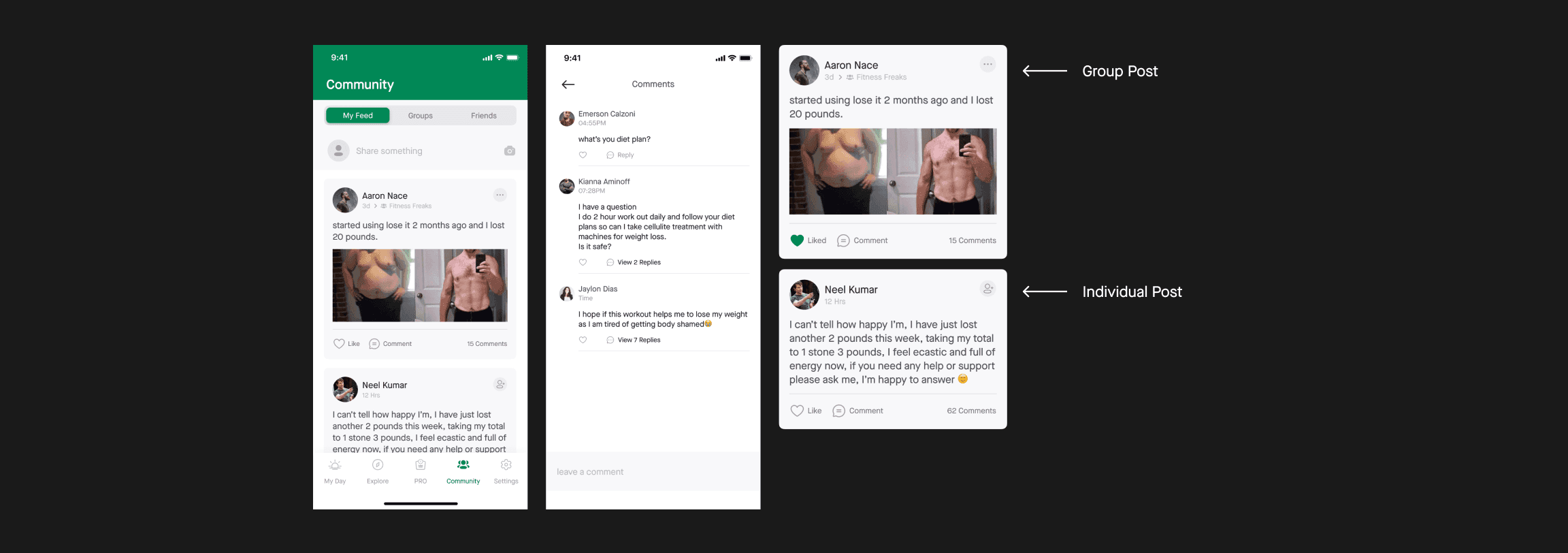
Made 2 cards for feed; one for group post and one for the individual post also gave visual treatment to the comment screen.
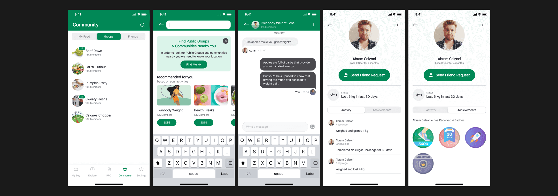
Now user can see all his groups at one place in the “Groups Tab”
the user can search for the group and join them also now the user can look for groups and communities in his/her local area, city, or state.
Users can (These 3 features mentioned below exists in the current app)
See other user’s profiles
Send friend requests
Can see other user’s activity & achievements (Digital Badges)
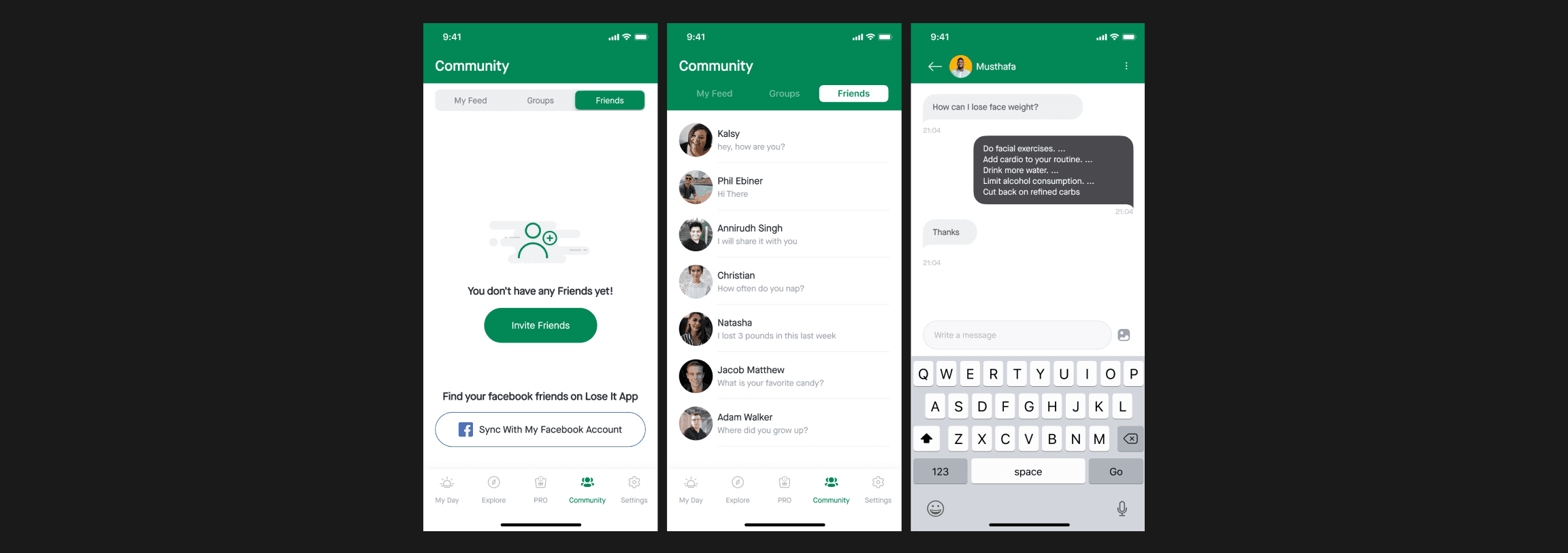
Users can sync their Facebook account to find their Facebook friends on lose It App and chat with friends.
Moving forward…
Settings
The settings tab in the app allows users to
Add their own food/recipes or custom exercises
Add a tracker such as Google fit, Fitbit, Apple watch.
can set unit preferences such as units kg, lbs, pounds for weight height, etc.
Achievements & other preferences stuff shown in the below image
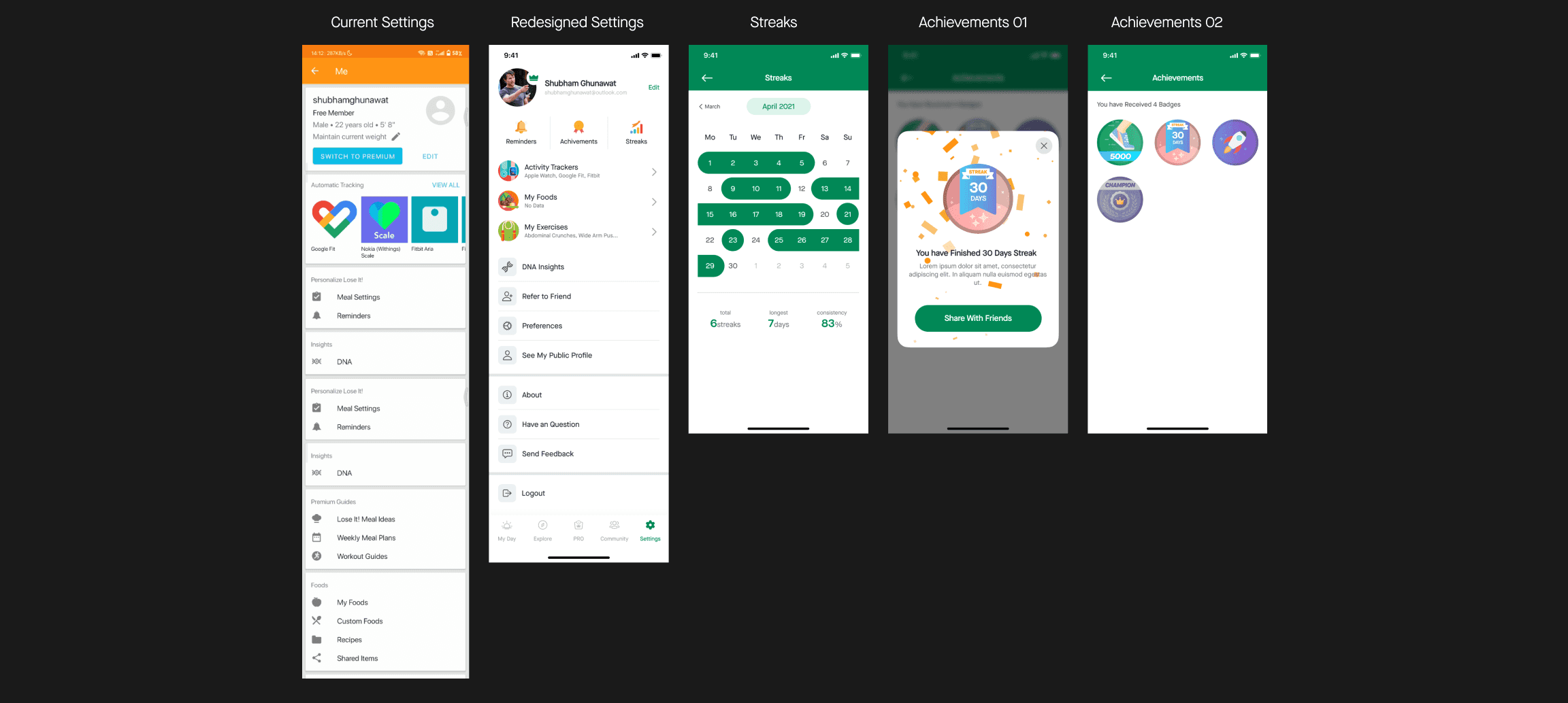
I made some tweaks to the layout in terms of visuals hierarchy
also, I added the “STREAKS” screen here, which allows users to see how consistent he/she is with goals.
The current app has gamification in order to make users educated, engaged, and entertain users on the platform
when a user is regular with logging food, completes a challenge, stays consistent with goals, the app gives user badges to motivate users more.
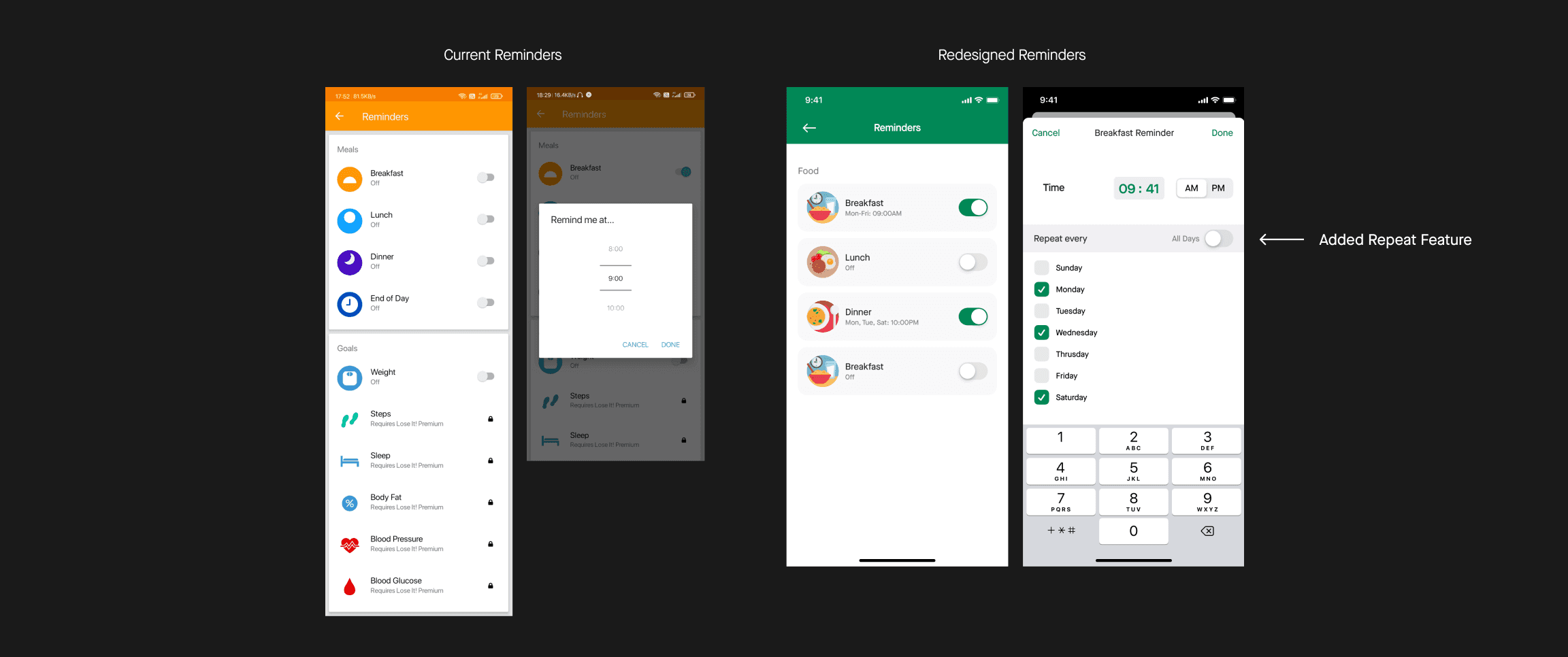
In the reminder screen, I added a repeat feature that will allow users to give ability on what day the user wants a reminder and what day he doesn’t.
Style Guide
As I was working on improving the User Experience In parallel, I worked on refining the visual design of the app.
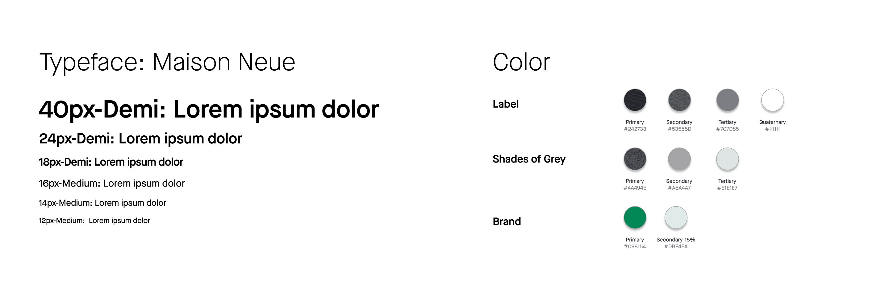
I developed a rule-based system to support typography, icons, and colors to achieve visual consistency.
I have always been a fan of the minimalistic approach and have applied the same here.
butttt do you wanna the coolest thing I did here? I have used only 6 fonts sizes to design 75+ screens

